 HackerTube.runGood videos, with context.
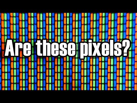
These Are Not Pixels: Revisited
About this video
Technology Connections follows up on his analog TV video to clear up the debate over whether CRT phosphor dots are pixels. He explains the shadow mask, color triads and how they relate to the scanned picture.
Why it appears in the archive
HN links it whenever someone equates CRT phosphors with pixels, as the clear explanation of why they are not.
AI-generated summary and labels from the source dataset; verify important details against the video. Source & credits.
From the Hacker News discussion
Obligatory Technology Connections video explaining how CRT pixels aren't really pixels as we understand them. Definitely worth the watch. [VIDEO]
Read original comment ↗If you’re wondering what it’s talking about when it says the triads of red/green/blue rectangles on a CRT display don’t correspond to pixels, here’s a Technology Connections video that explains it: [VIDEO] But on an LCD, the display really is made up of a bunch of solid-colored rectangle-ish shapes, and if the LCD is using standard RGB pattern, each red/green/blue triplet does correspond to one pixel. So if you zoom in, “a pixel is a little square” is very close to the truth. In other words, the article shows its age…
Read original comment ↗> The traditional excuse for stripping away ornament has been about improving legibility, especially for small screens. This is a fallacy No, serifs really do have legibility issues, but not for small screens ; they cause problems at (very) small font sizes where glyphs are only a handful of pixels tall. > You can render a serif letter in seven pixels Yes, but that's pushing it and the legibility will depend on the quality of the font hinting, how the font rasterizer antialiases, and the way subpixels are utilized[1]. Legibility will even depend on the display technology: low resolution fonts on a CRT can be a lot harder to read compared to an LCD. (a shadow mask means phosphors do not align 1-to-1 with pixels[2]) Of course, legibility is in the eye of the beholder, and many people find serifed fonts to be easier to read, while others prefer sans-serif, and some people just don't care. For some people, anything smaller or more complicated than high-contrast 96pt simple sans-serif is unreadable. > drops the serifs from its logo A logo, however, is probably (much?) larger than the small font sizes where serifs often have legibility issues. [1] [LINK] [2] [VIDEO]
Read original comment ↗"240p" is not a meaningful statement when referring to CRTs. CRT phosphors are not pixels. For more on that: [VIDEO]
Read original comment ↗The electron gun draws through the shadow mask, which is fixed and independent of resolution. It's a debate long enjoyed by nitpickers. [LINK] [VIDEO]
Read original comment ↗